Case study / 03
2026 · Life Upside View
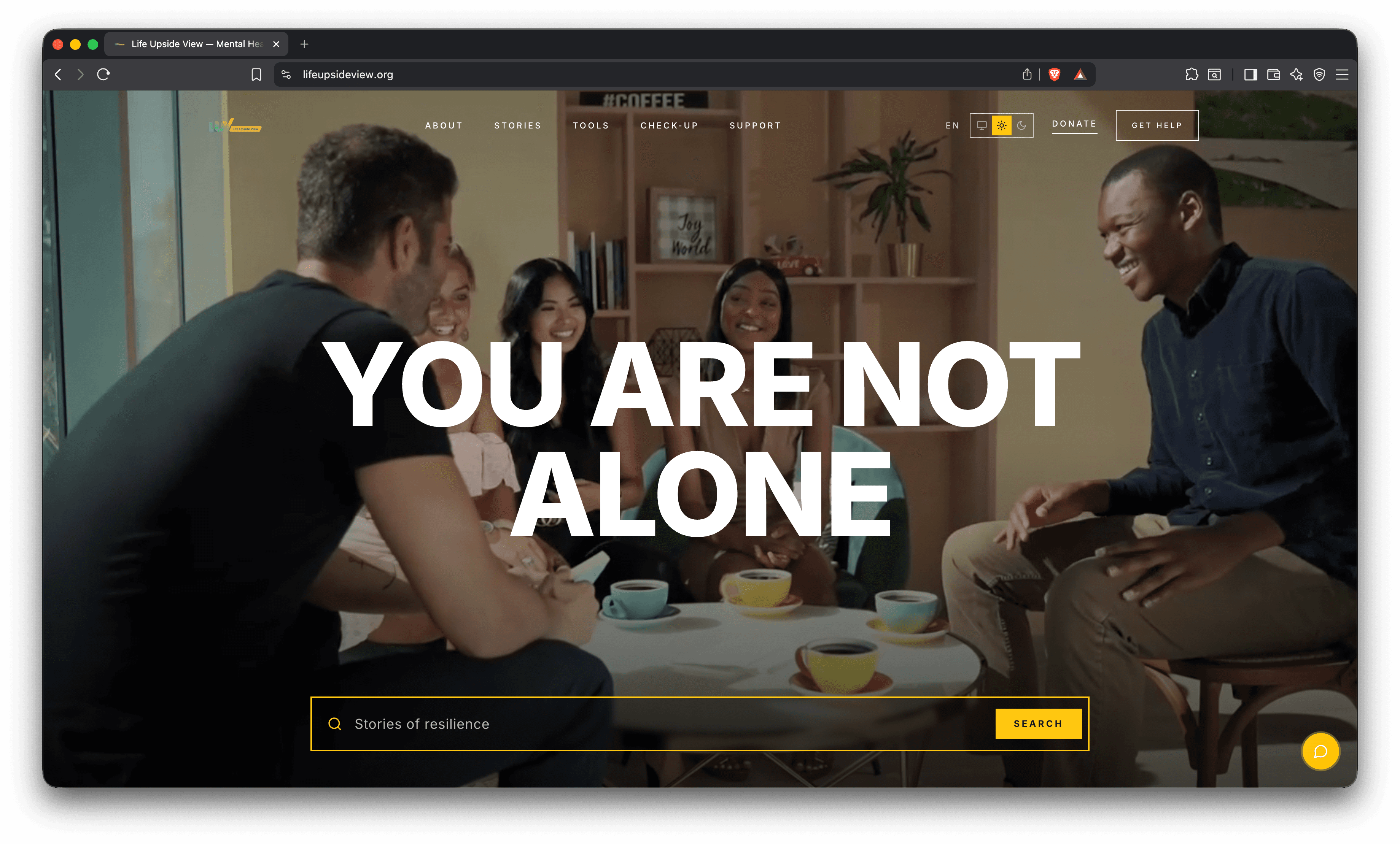
A mental-health platform built around one promise: you are not alone.
A support platform for people in a hard moment. Somewhere to find a story, a tool, or a fast way to reach help. The design was the client's; the build was ours: steady, quiet, and quick to load on the phones people reach for at 2am. Searchable stories of resilience, a low-pressure self check-in, light and dark reading modes, more than one language, and a Get help button that never sits more than a tap away.
- Role
- Development
- Stack
- Next.js, Tailwind, Vercel
01 / Problem
When someone is reaching out, every bit of friction is a reason to close the tab.
Life Upside View had to meet people at a low point. Often anxious, often late at night, often on a slow connection. And it had to get them to something useful without making them work for it. Here the basics carry real weight. A page that stalls, a menu that's hard to scan, a help link buried two clicks down: none of that is a small flaw. It's a person who leaves before they find anything. The client knew exactly how the site should look and feel. Our job was to make that real without letting it turn heavy or hard to reach.
02 / Approach
Build the client's design faithfully, then make it fast, legible, and easy to reach help from.
We worked directly with the client and built their design as specified, hand-coding it so the warmth of the original survived the move from mockup to live product. The open imagery, the single steadying line, the calm spacing, all of it intact and none of it heavy. A “Get help” route stays one tap from every screen. Light and dark modes let people read in whatever's easiest on the eyes that night, and a language toggle widens who the site can serve. Stories of resilience are searchable instead of buried, and the self check-in reads as a few honest questions rather than a clinical form. The whole build is tuned to stay quick on the mid-range phones most of the audience is holding, because in a hard moment, load time is part of the care.
03 / Outcome
A calm front door that does the hard part: getting people to help, fast.
The site launched true to the client's design and fast where it counts. Readable in both themes, usable in more than one language, and quick to surface a story, a tool, or a way to talk to someone. Everything that matters sits a tap or two from anywhere on the site: the standing Get help route, the low-pressure check-in, the searchable stories. Built to the client's brief, hand-built for speed.
Up next
Whitesands School